What Is Responsive Web Design?
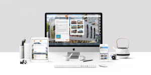
Responsive web design is where a website will ‘respond’ to various different devices and adjust itself accordingly. This means that a website will detect the screen resolution of different devices — like phones, laptops, TV screens, smart watches — and resize and reorganise its elements accordingly.
It doesn’t just adjust to the screen resolution though, it also will react to the platform that the user is using. For example, if a website has a video, it will load it slightly differently on an iPhone versus a Windows PC.
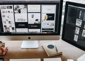
How Does It Work?
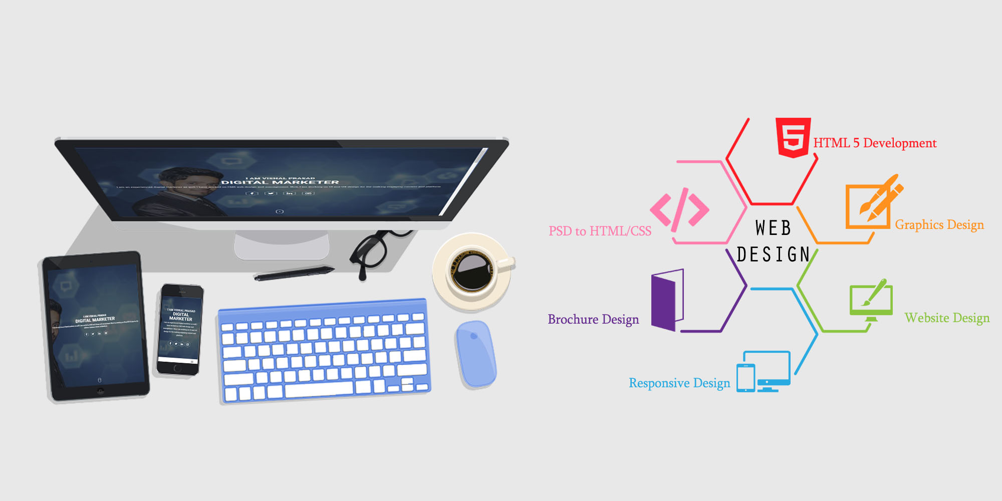
 Quite simply, a website will respond to different screen sizes and orientations. You can see this when using a web browser, if you adjust the size of your browser window, you can see the elements start to shift. The same occurs if your phone or tablet rotates. The elements in a web page are the same, just as the resolution of the screen being uses changes, the orientation and size of the the elements will change, in order to make a website equally easy to navigate on all devices. For making your website responsive you need the services of Web Design company which has many years of experience in this field, responsive website design is the choice of many customers as people are now using more mobile devices, and the website that fits on all devices becomes popular on search engine ranking.
How Does This Differ From Traditional Web Design?
Before mobile phones has access to the internet, a web page would not be designed to respond to the device on which it was being used. This represents a big problem when it comes to modern day websites, as users on portable devices will have to ‘pinch and zoom’ to see conventional websites which are not responsive, which is hard to see and not a pleasing user experience.
Why Is It Important?
In the past year, mobile traffic has overtaken PC traffic as the dominant way that people access the internet. This means that most people who are using your website are likely to be doing so on a phone. As a result of this, a traditional web page will be extremely difficult to use for the majority of people using your website! This should be very alarming for anyone who is interested in having a website which fosters a good user experience which brings them back — no one goes back to websites that are frustrating to use!
In addition, laptop and desktop screens very greatly in size. If you use a responsive web design strategy, your websites will look just as good (and be just as easy to use) on any PC on which a user attempts to access your website. This could otherwise be a very big problem for users where certain elements do not display as well on laptops as they do on PCs, and vice versa.
Another huge benefit of this kind of web design is that it facilitates sharing of your content on social media. Social media engagement is a simple way to get users to see and interact with your web content (it’s virtually free advertising), and responsive web pages are much easier to condense and share.
So, you should certainly consider changing any websites you have and making them responsive, if they are not already.